
Ball x Oracle Time Engineer II Dazzle
Ball Engineer II Dazzle: When Confusion Is the Point
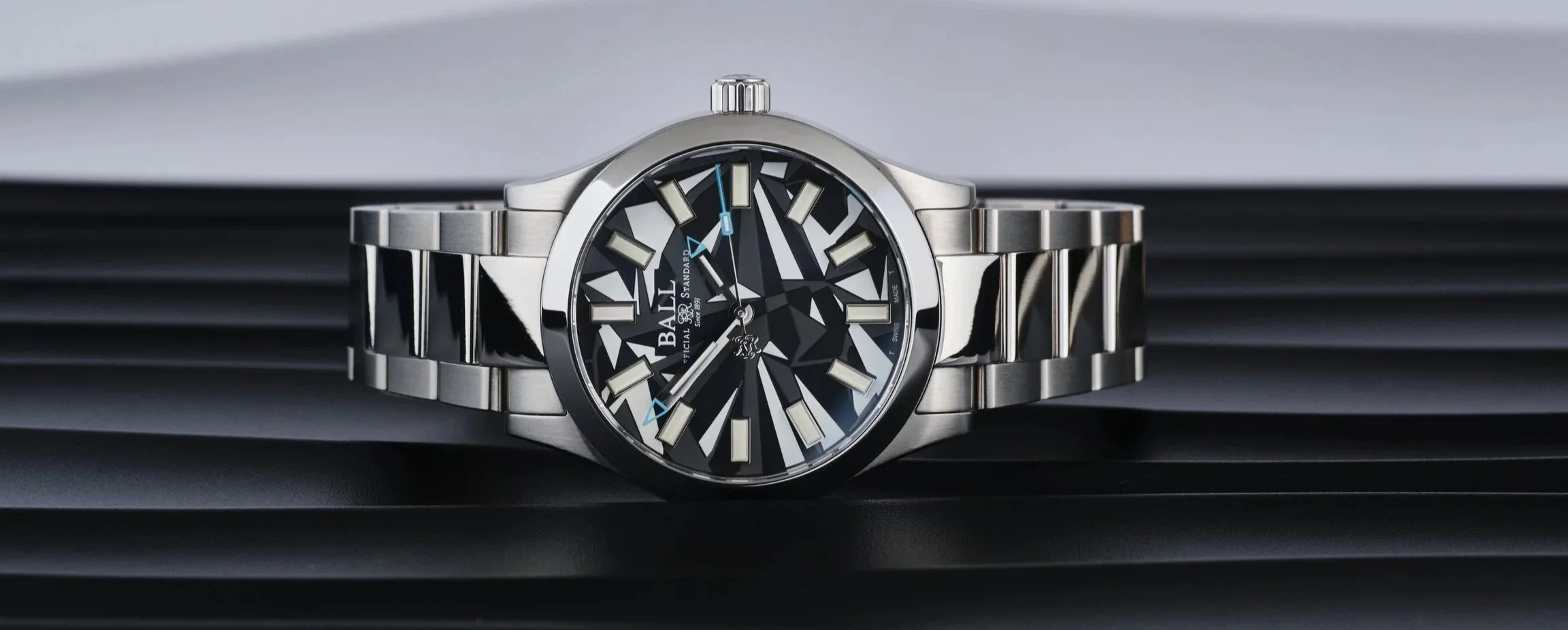
There are watches designed to be beautiful. There are watches designed to be tough. And then there’s the Ball Engineer II Dazzle, which appears to have been designed with one very specific brief in mind: be so visually confusing that nobody quite knows what they’re looking at. Collaborating with Ball, Oracle Time has produced a watch that plays with the idea of camouflage while doing absolutely nothing to disappear. Despite the camo-inspired dial, it stands out confidently on the wrist, making no attempt to hide itself, and that, rather fittingly, is the whole point.
And honestly? I kind of like it.
The inspiration comes from “dazzle camouflage,” a World War I Naval strategy where ships were painted in wildly contrasting geometric patterns, not to hide them, but to make it harder for enemy submarines to judge speed, distance, and direction. The logic was simple: if you can’t disappear, at least be misleading. Ball has taken that concept and applied it to a modern sports watch, and the result is something that feels genuinely different in a sea of safe black dials and polite sunbursts.
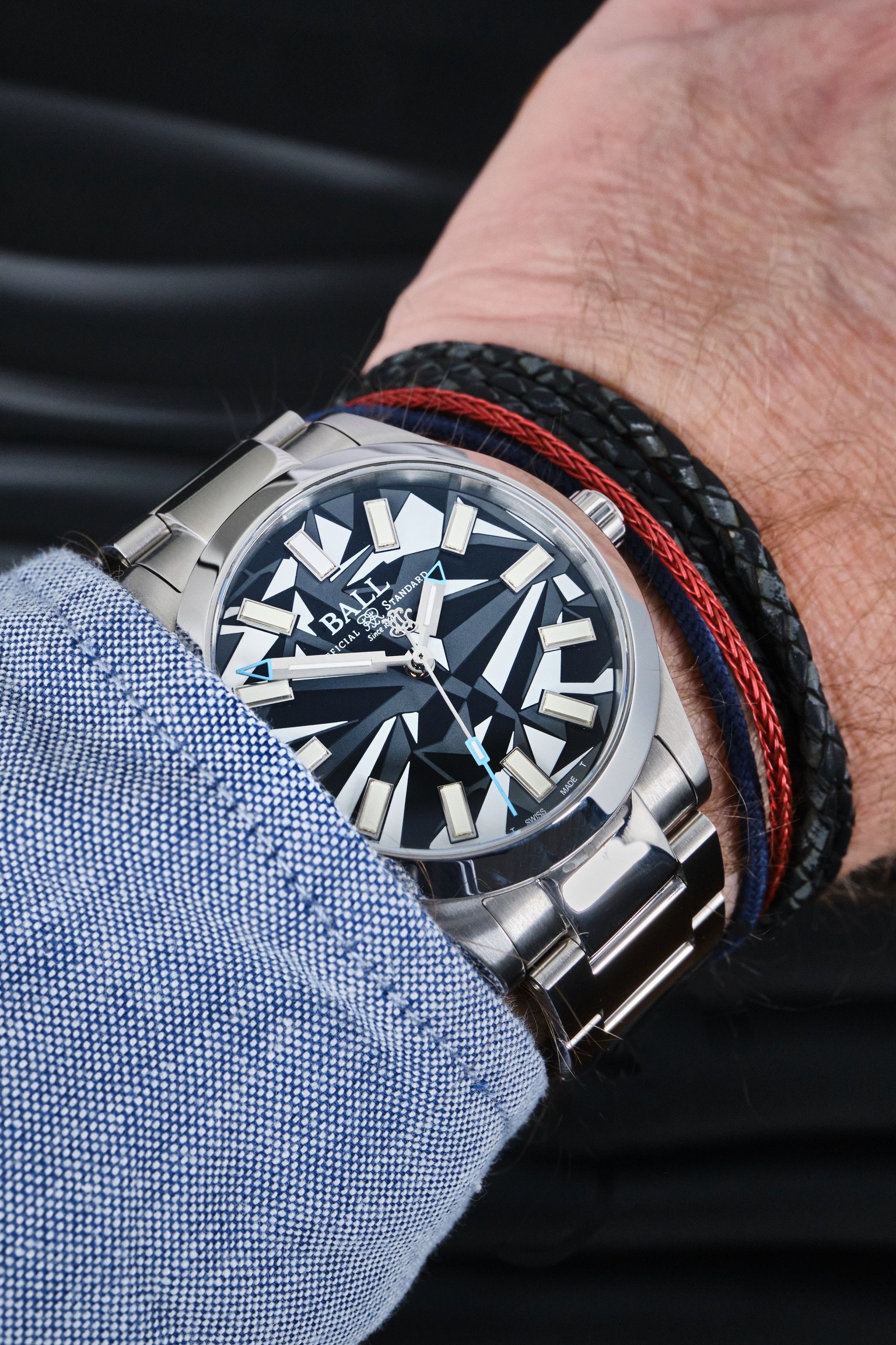
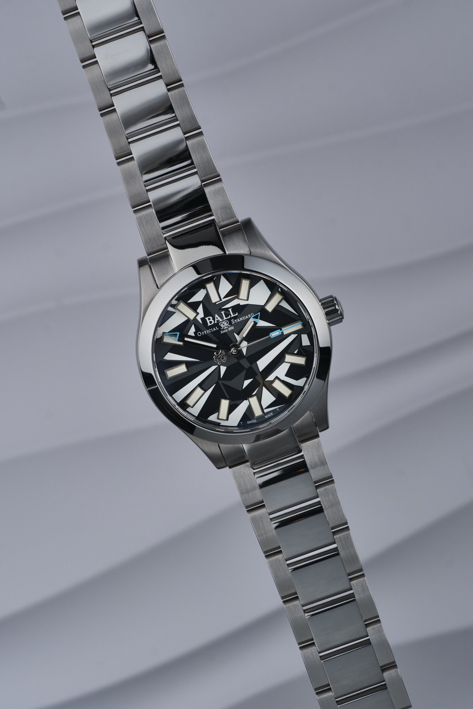
The dial is the headline act here. Angular blocks, high-contrast colours, and fractured geometry create a look that’s deliberately disruptive. It’s busy, yes, but not carelessly so. Spend a few minutes with it and you realise it’s actually very well organised. The hands are bold, the markers are crisp, and the layout is unmistakably Ball. It just happens to look like it’s wearing experimental war paint.
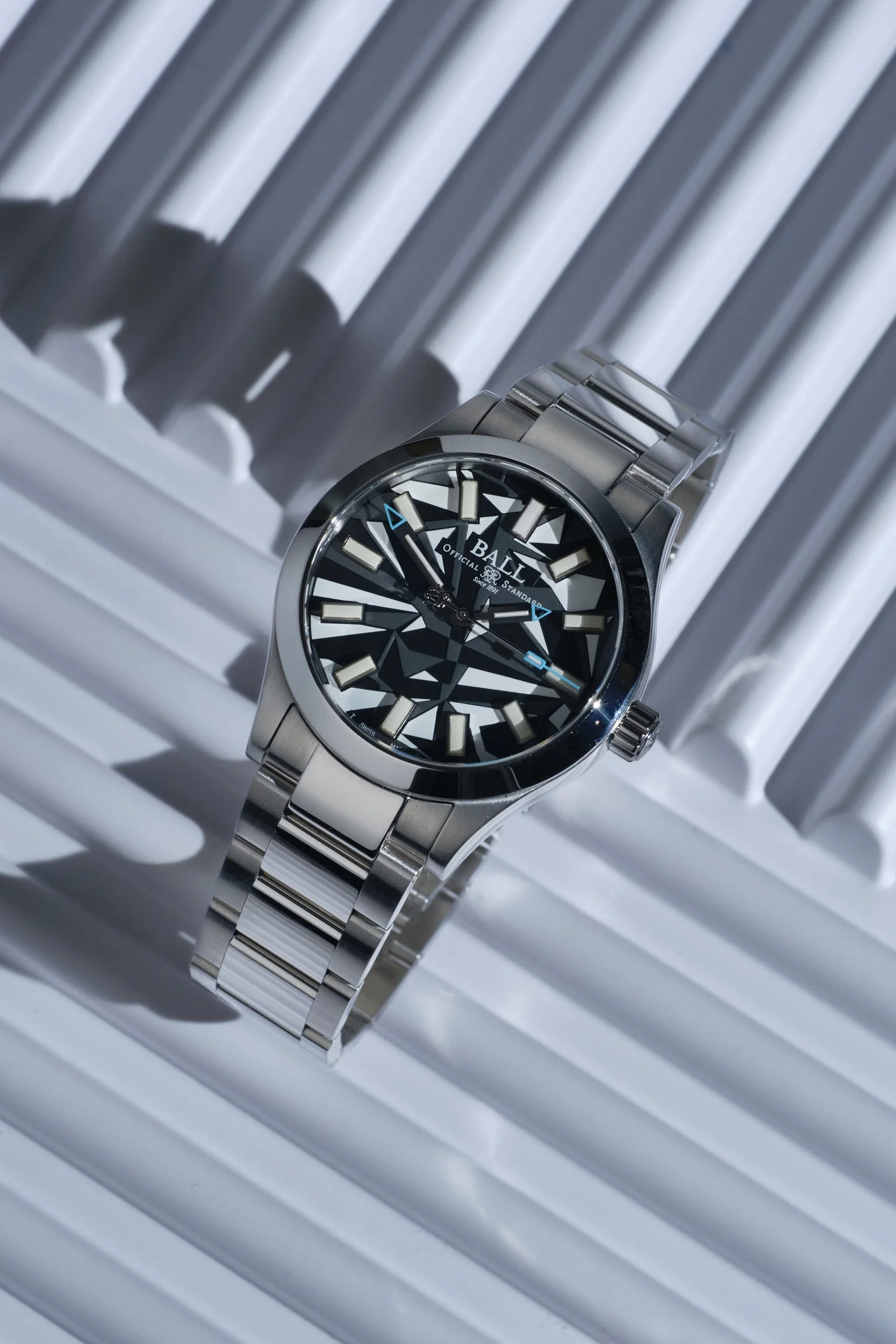
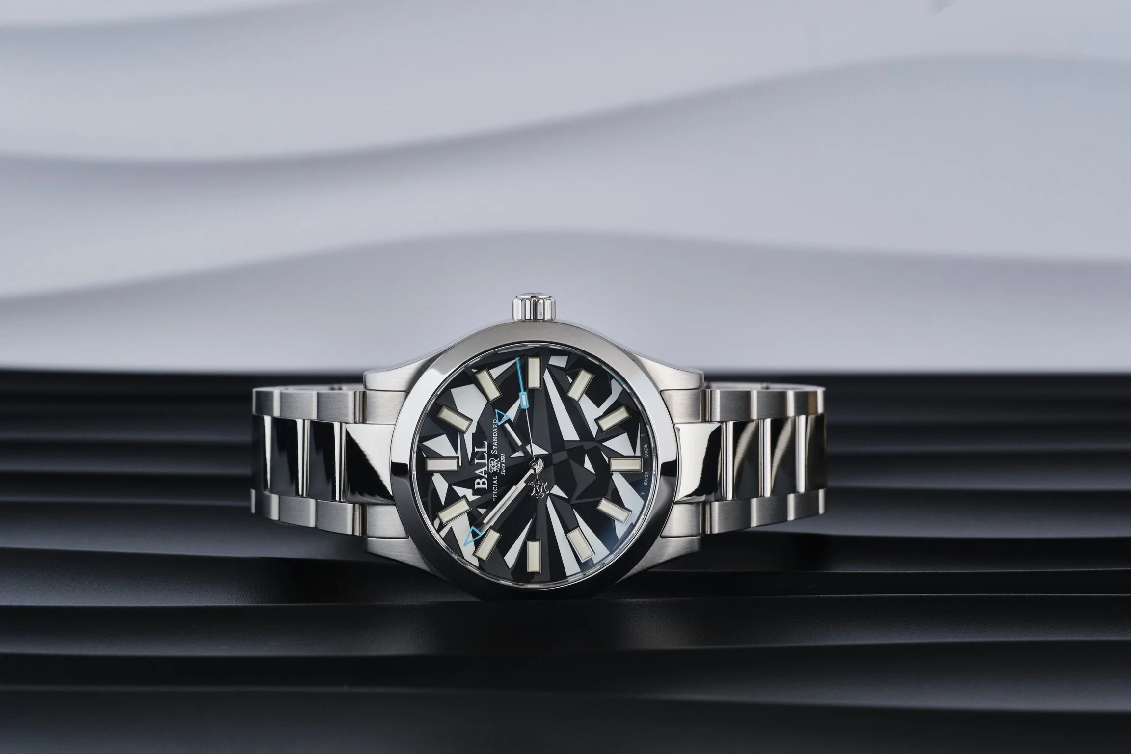
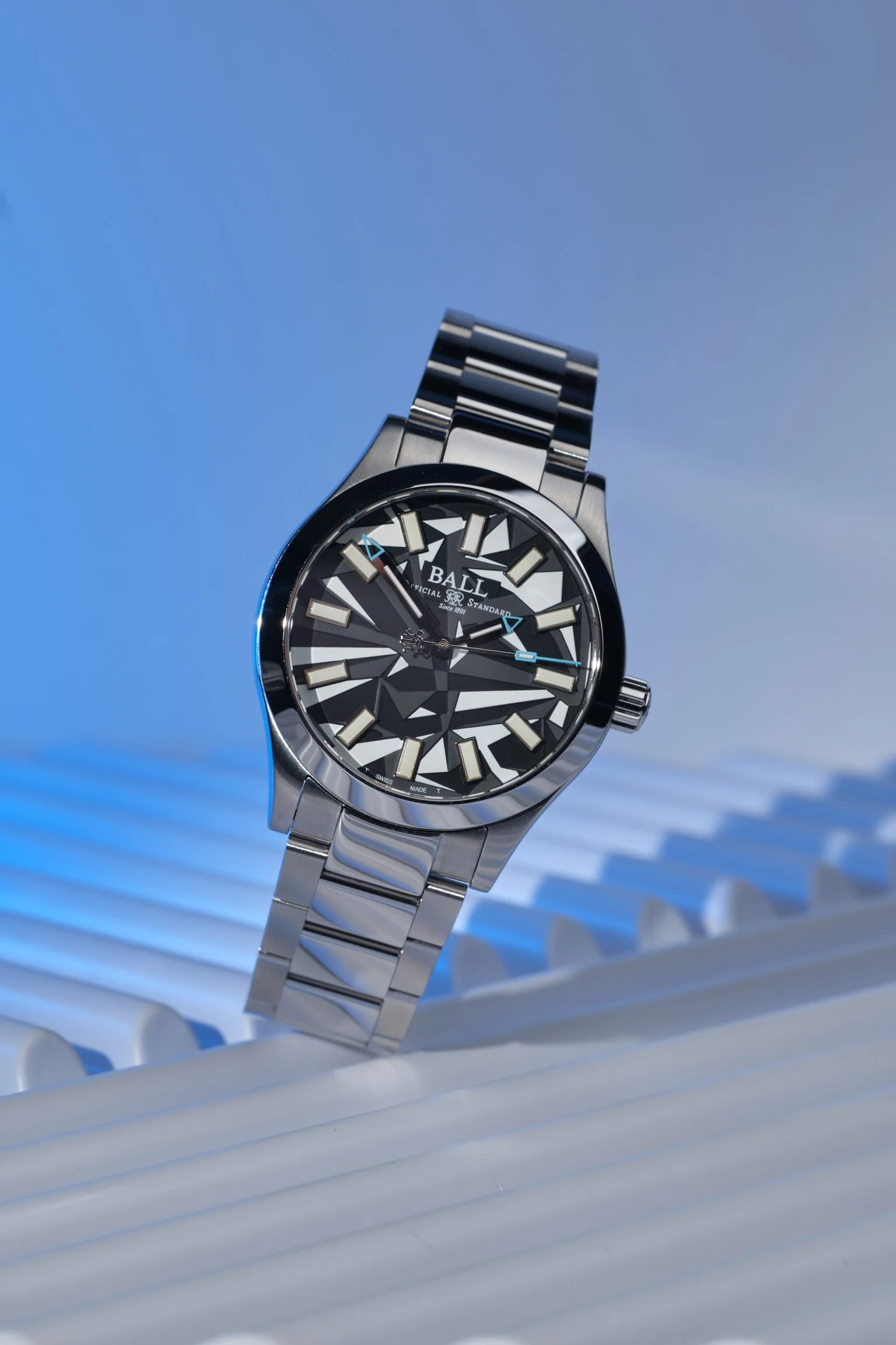
As for legibility, it’s not the clearest watch to read due to the white and black architecture on the dial. The hour batons, almost dissappear, and the polished hands I dont feel contrasts enough. However, drop the light and those gas microtubes, Ball’s signature party trick, glow like radioactive glow worms in low light. Unlike lume, they don’t need charging, encouragement, or a pep talk. They’re just… on. All the time. Forever. It’s one of those things that sounds like marketing fluff until you live with it, and then you start wondering why more brands don’t bother. The blue tipped hands too aren’t as clear as they could be, but maybe thats my failing eyesight.
The case is classic Engineer II territory. Solid, purposeful, and built like it could survive being dropped down a lift shaft. This is not a watch pretending to be rugged, it actually is. Anti-magnetic protection, shock resistance, and water resistance that feels reassuring rather than theoretical all come as standard. Ball has always leaned hard into functional engineering, and the Dazzle is no exception, no matter how playful the dial may appear.
On the wrist, it wears better than you might expect. Yes, it has presence. No, it’s not subtle. But it’s also balanced, comfortable, and unmistakably a tool watch rather than a novelty piece. The bracelet is solid, the finishing is honest, and everything feels like it’s been designed to last rather than impress someone in a boutique under flattering lighting.
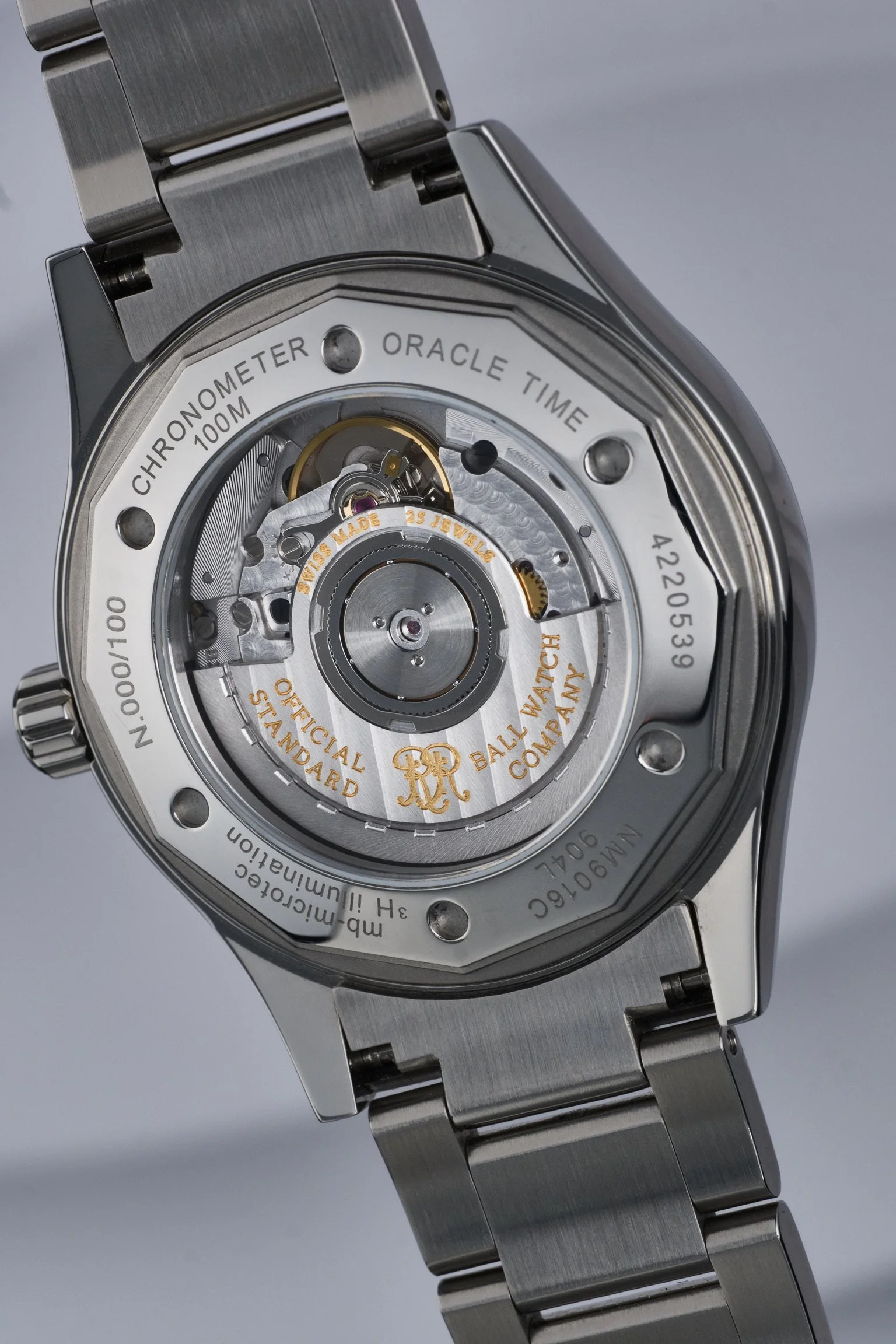
Powering it the BALL RR1101-C COSC certified automatic movement that does its job quietly and reliably, which is exactly what you want here. This watch already has enough personality, and with it’s display caseback, definitely looks the part.
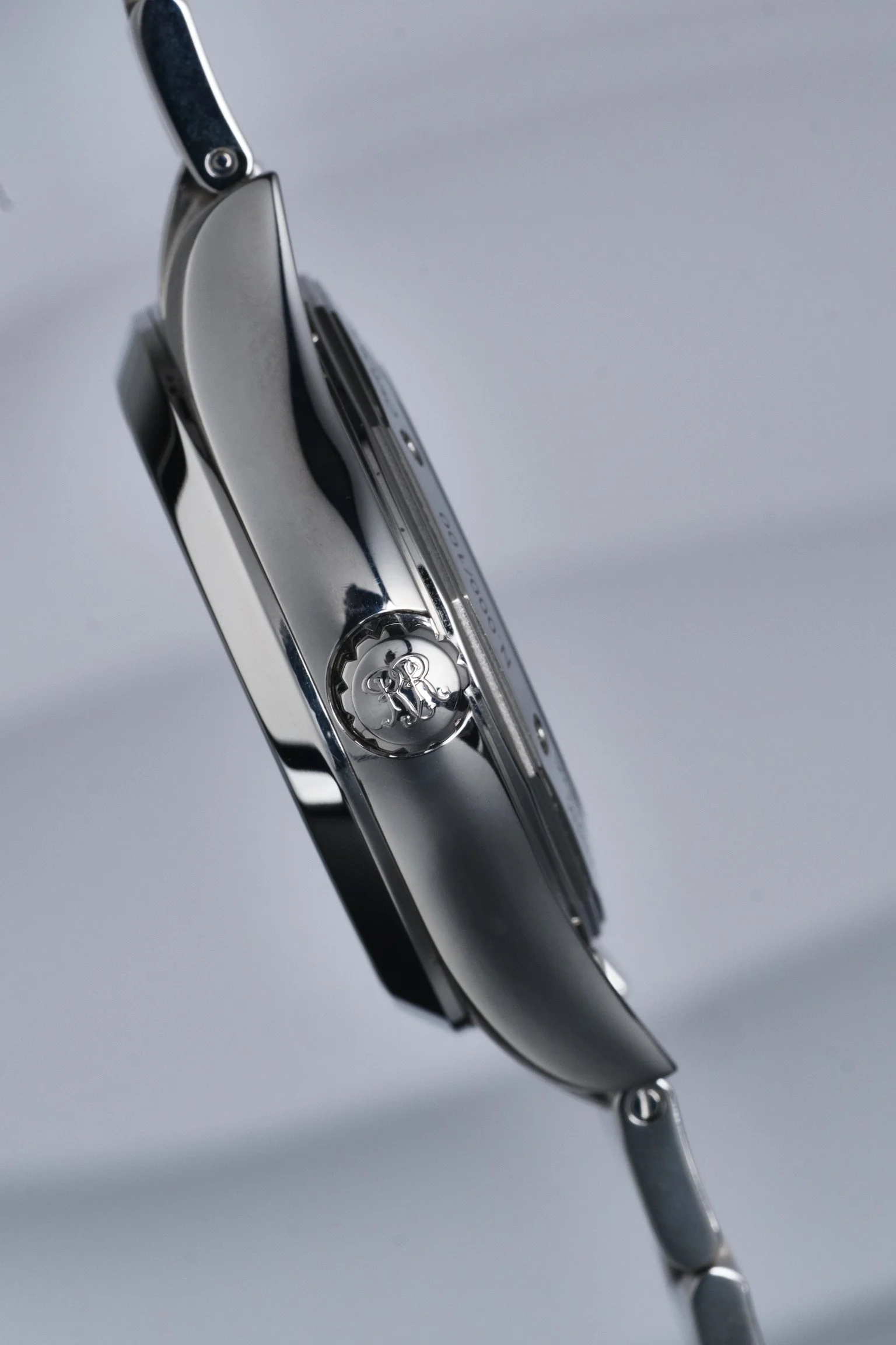
The Ball Engineer II Dazzle is not a watch for fence-sitters. If you like your watches discreet, minimal, and politely inoffensive, this will absolutely not be your thing. But if you appreciate history, engineering, and the idea that a watch can have a bit of attitude without tipping into gimmickry, then the Dazzle makes a very strong case for itself. I would personally have had slightly less of a polished case and bracelet, perhaps some brushing may have worked a little better.
More importantly, it feels honest. This isn’t a limited edition cooked up because someone in marketing fancied a different colourway. It’s a watch with a clear narrative, executed by a brand that knows exactly what it’s good at — and sticks to it. If it had a few less polished surfaces and hint of brushing, then it would be more up my street. However, for those who like an Explorer look, at a fraction of the cost, then this is worth a second look.
In a market increasingly obsessed with vintage reissues and safe plays, the Dazzle stands out by being unapologetically bold. It doesn’t try to disappear. It doesn’t try to please everyone. It just does its thing, confidently and a little defiantly.
And frankly, that’s exactly the kind of confusion I can get behind.